


Introducing the Bloxworth Heritage Diver – Chromatic Collection

Feeling Blue, Yellow, Pink, or Maybe Orange?
Tricky thing second albums. But when the original hits all the right notes, it's a good point to jump from.
The original Bloxworth Heritage Diver was born during lockdown, which afforded us an unusually generous stretch of time to obsess over the tiniest details. The result? A bold, colourful dive watch collection full of character inspired by the ‘60s, with rugged ability and some of the best finishing we've ever achieved.
Crisp gloss black ceramic bezels, layered and textured dials, and tiny polished facets that highlight the classic case proportions with understated pops of reflective joy. All backed by our standard ruggedisation including, shock protection, triple seals, 200m water testing and topped off with our now-iconic colourful deployant rubber straps.
So, how do we follow that?
Easy: simplify, refine, allow ideas and stories to develop and don't even think about diluting with any sort of concensus. Just give the best stories the space to breath and come to life in all their undiluted glory.

We Give You The Bloxworth Chromatic Collection
A vivid evolution in tone, texture, and style.
We took everything we learned from the original and distilled it into the beautifully resolved Chromatic Collection. New dials, crisp hands, and colour-ways that feel bold yet endlessly wearable.
Let’s start with the hands - completely new and oh so gorgeous.
Gone are the bold, square shoulders of the OG's hands. In their place: our new “vintage diver” design, raised through the centre with a chine line that catches the light flooded with SuperLuminova for functionality and classic elegance. Still superbly visible in low light, but now with iconic style.
The hands weren’t the only architectural change we made… We even went back to the drawing board on the deployant clasp. The revised low profile double deployant buckle is elegant, durable, and delightfully tactile so as to delight even the most die-hard pin buckle enthusiasts. Complete with a subtly embossed EB shield filled with SuperLuminova. The smaller clasp design with lozenge-like chamfered edges is so easy to wear, it's elegant and durable just like the collection.
Let’s Talk Colour

It’s one of the hardest things to perfect in watch design. A fraction of a Pantone shift can change everything. Then there's surface texture… matte, gloss, layered, fumé? The choices are endless.
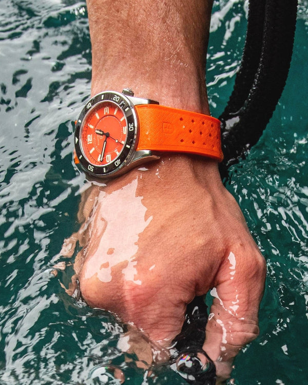
But sometimes, when you go for it, the result is just right. Take the all orange model: it’s a real statement, yet somehow universally wearable. The other variants are just as playful, like the chalky Harbour Blue dial warmed subtly with a Meadow Yellow reflector ring, or the unexpectedly perfect ‘Drunk Tank Pink' with soft grey, a firm and surprising favourite in the office. Finally there's textured Navy framed by Pale sky blue with orange, colours inspired by Sea Glass finds on Dorset beaches.
Even the ceramic bezel markers have been tweaked to match each colour palette. Look closer and you’ll spot the switch from printed to applied indexes on the wave textured dials, a small change that lifts the dials into a refined space.
And with strap choices the combinations are almost endless. Pair blue with yellow. Contrast orange with grey. Add a webbing strap with a coloured pinstripe, or smarten things up with a bracelet. Each combo tells its own story, your story.
The Chromatic Collection is playful, oozes precision and is thoughtfully resolved from every angle. It’s a love letter to the joys of wearing a watch that looks great and just works; no matter where you take it.
We’ve never had this much fun with colour. And we hope you do too.