


The Tyneham
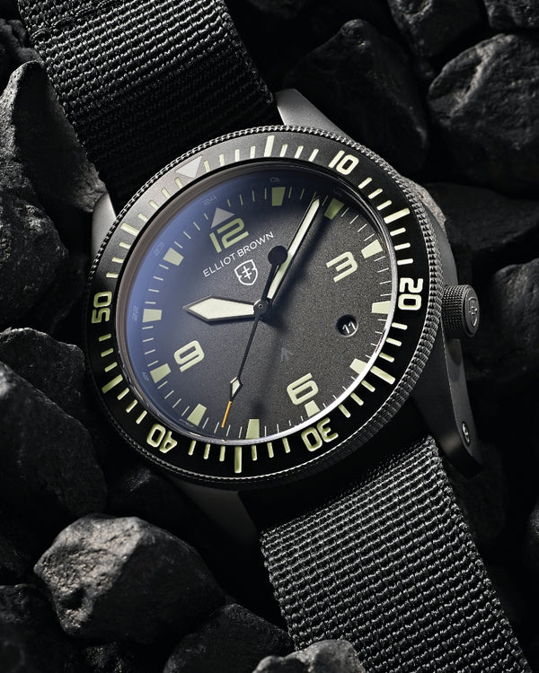
The Tyneham’s elegance comes from the relationship between two views; from the side, the case appears almost slabby, with only a deliberate, tapering undercut surface next to your wrist to soften its lines. In plan view however, our trademark deliberately short, narrow shoulders transform it into something luxurious yet clearly robust with shoulders that are slender for the apparent heft of the case, and it’s this relationship between the two views that makes our cases so individual.
In order to continue our ‘subtle durability’ goal, we wanted to ensure the bezel protected the crystal without appearing to do so, so we mounted the crystal fractionally below the edge of the bezel in order to help protect the traditionally vulnerable edge from chipping, and then hardened the bezel to 1200HV0.05 – six times harder than standard stainless steel.
The result is a bezel that’s able to shrug off bumps and scratches longer than an unhardened equivalent but doesn’t draw attention to itself.
To compensate for mounting the glass below the surface of the bezel and potentially starving the dial of light, we created a chamfer around the inner edge of the bezel and another larger chamfer around the circumference of the anti-reflective sapphire crystal to allow more light onto the dial. The crystal itself is perfectly flat on both sides, to eliminate any visual distortions if the watch is viewed at an angle.
We believe that the caseback design is an opportunity to create something truly spectacular on a space that other brands waste. The Tyneham's caseback is no exception: we reworked our ‘usual’ caseback design (which is already pretty nice by most standards) and added the contour-line graphic texture that we use inside our rubber straps as a nod to our watches’ outdoor heritage. We also refined the inscription around the circumference, deep-acid-etching the references to the Japanese automatic movement and the sapphire crystal.

We redesigned the crown so make it larger but shallower than the crown we fit to the Canford, in keeping with the Tyneham’s case architecture, with subtle parallel knurling, rather than diamond knurling, which adds precision and elegance that echo the lines of the case. It’s recessed into the case at our trademark 4H position to stop it digging into your wrist, with a gentle radius on the outer edge and a subtle EB shield logo.
A lot of our customers change their straps frequently, so in order to accommodate them without sacrificing any strength, we revised the Tyneham strap bars, making them single-sided, screwing directly into the case, meaning only one screwdriver is required to change or replace the strap.
As the case is smaller than our other watches, we wanted to ensure the Tyneham dials remained visually ‘spacious’, with smaller numerals spaced more widely, and a narrower internal bezel that creates a sense of space that makes them easy and pleasurable to read, and stops them becoming crowded or fussy.
The calendar is custom printed to match the colour of the dial graphics, and is unobtrusively located at the 5 o’clock position to minimise visual distractions and also to visually balance the power-reserve arc at 1 o’clock, and is visible through a circular, chamfered window. The date is also printed vertically, rather than radially; something we always try for, space permitting.
Two dials have three-dimensional applied indexes with a height that creates a sense of subtle luxury; the matte black dial fitted to the ‘001 is heavily overprinted in Superluminova so that every numeral (and every baton) glows at night, and the ‘003 and ‘005 use electroformed foil graphics for subtlety. Three of the dials (the ‘002, ‘003, and ‘005) use ‘sunray’ pattern dials, created by polishing the dial-blank and then painting it with a translucent laquer rather than opaque paints.
The three most classic designs use ‘sword’ hands that broaden from the centre to the tip, whereas the ‘001 and ‘005 have a bolder style of hand with a different taper. Every model uses Japanese SuperLuminova in varying applications, depending on the model: Every numeral and baton (and the EB shield) on the ‘001 glows blue, along with the hands; the ‘002, ‘003, and ‘004 have hands that glow blue and small luminous hour markers, and the ‘005 has small hour markers and SuperLuminova-filled hands that glow green.
The Tyneham leather straps were made using a new cutter specific to this model, and taper from 22mm to 20mm under your wrist, to compliment the smaller case, and to reduce the bulk under your wrist. All the leathers have a matt nubuk finish with matching stitching and are designed to age gracefully. They fit snugly up to the case with nylon inserts for strength, and are secured with a narrower version of our current deployant buckle complete with our luminous EB shield.
The grey felt strap was sourced long before we even had a watch to fit it to, because we loved it when we found it. Contrary to what you might think, it doesn’t stretch or shrink if it gets wet, and ages very gracefully, even when worn frequently. Unlike the leather straps, the felt strap isn’t fitted, but is free to pivot around the strap bar, accommodating smaller wrists, and is fitted with the same tongue-buckle as our rubber straps.
The Tyneham’s movement is a Japanese-made Miyota 9130 automatic with a 42hr power reserve, hack (- the second hand stops when you pull the crown out), and hand-wind, with a power-reserve indicator at 1H to show how long the watch will run for before needing to be worn or wound.
The automatic winding system is incredibly efficient, unlike some early automatics, and will wind itself fully even whilst just being worn at a desk in an office; it doesn’t need hours of vigorous activity.
The movement is decorated with subtle Geneva striping across the automatic plate and balance cock, and the rotor is decorated with a subtle EB shield appliqué in gold to match the balance and the automatic winding wheels and etched with the Elliot Brown wordmark. This can be seen on the limited edition versions with the sapphire caseback.

As well as Miyota’s shockproofing system fitted as standard to protect the balance staff, the Tyneham also uses an improved version of the shockproofing system we developed for the Canford and Bloxworth. In order to protect the inherently delicate automatic movement, the shockproofing elastomer inside the Tyneham is larger in cross-section than the elastomers used in our quartz watches, and in conjunction with a raised section inside the case caseback and a floating movement ring, supports the movement from every direction.
The Tyneham’s presentation box is beautifully tactile and enjoyable to handle, wrapped with a smooth matte black rubber with a stitched edge and a padded top with a subtle debossed logo. The interior is custom-machined from a solid block of closed-cell foam wrapped in black Alcantara that supports the watch cushion perfectly, with one screwdriver supported inside the foam with semicircular notches to make removing it easier.